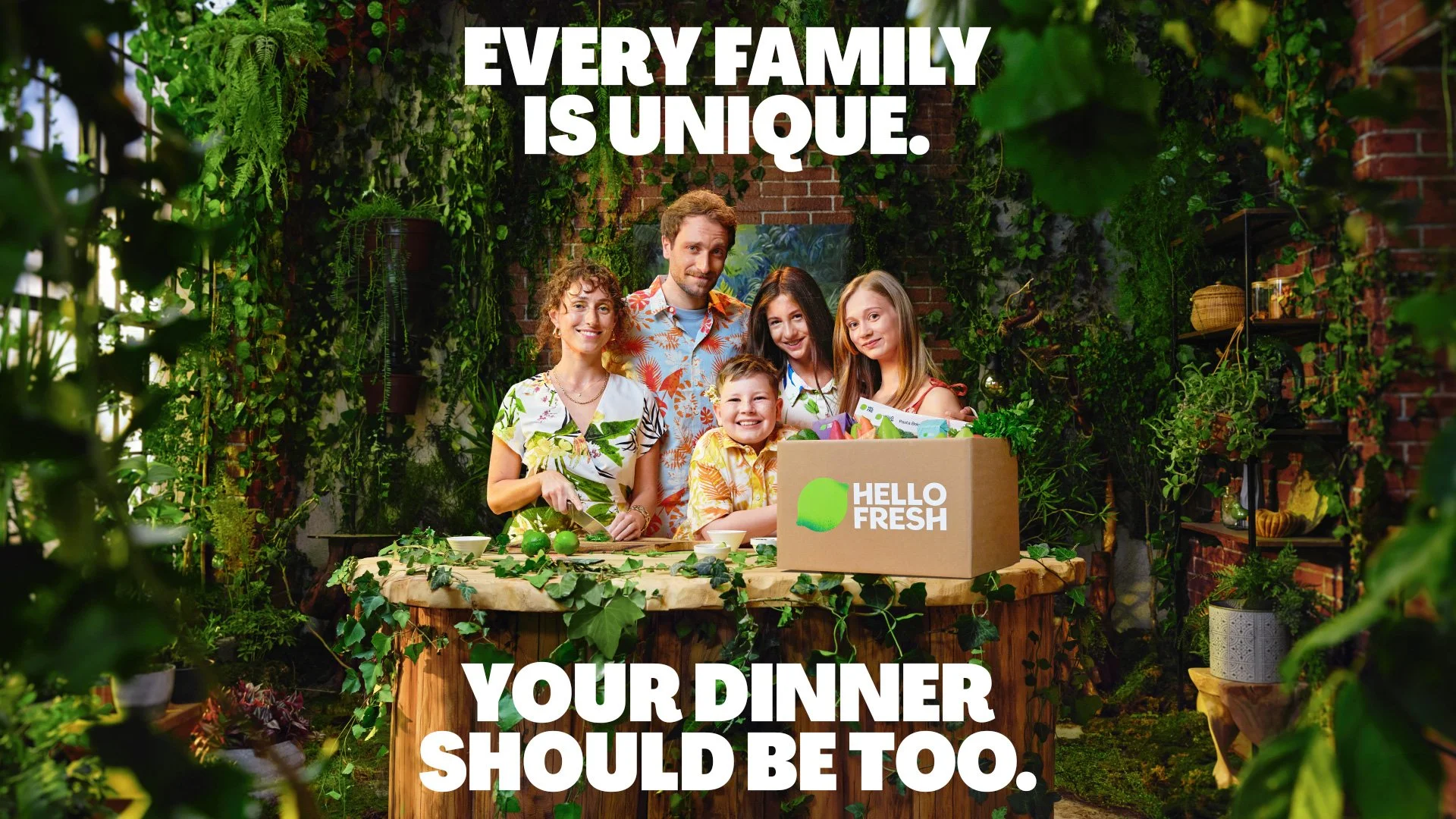
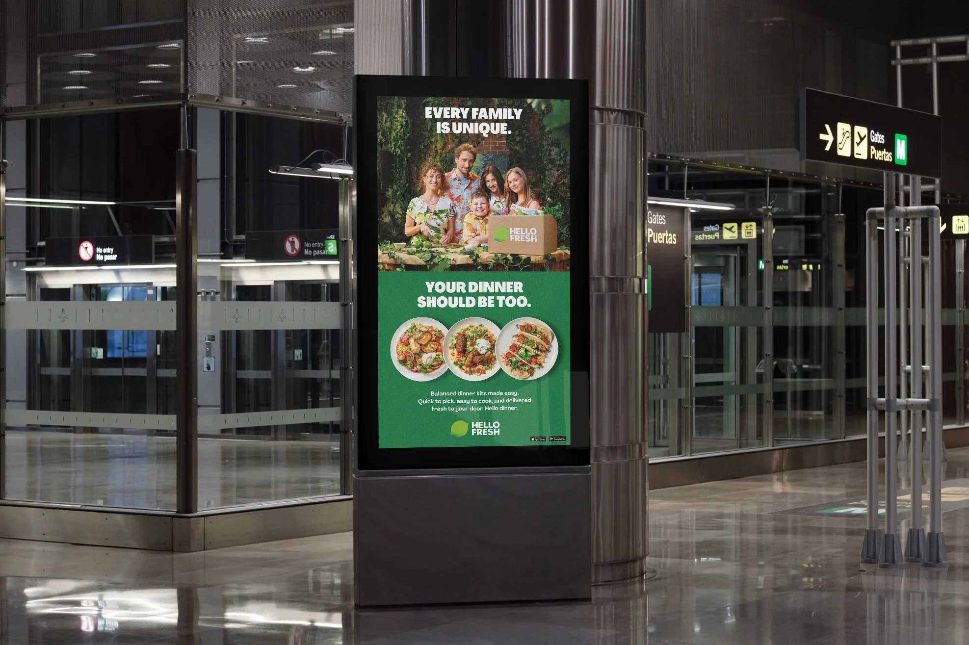
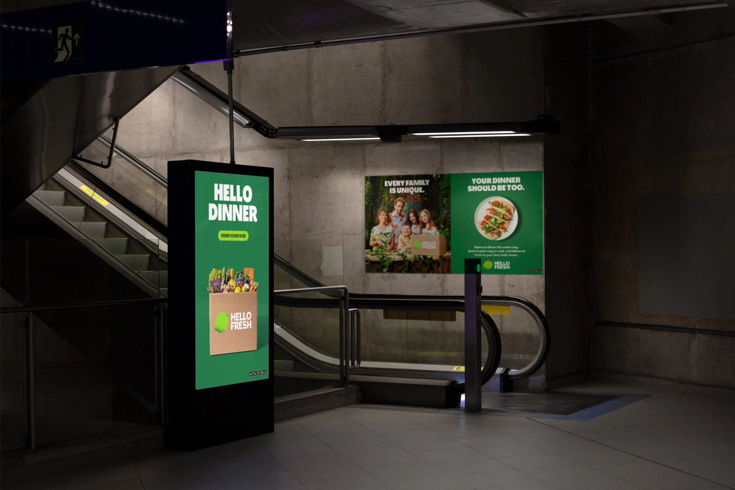
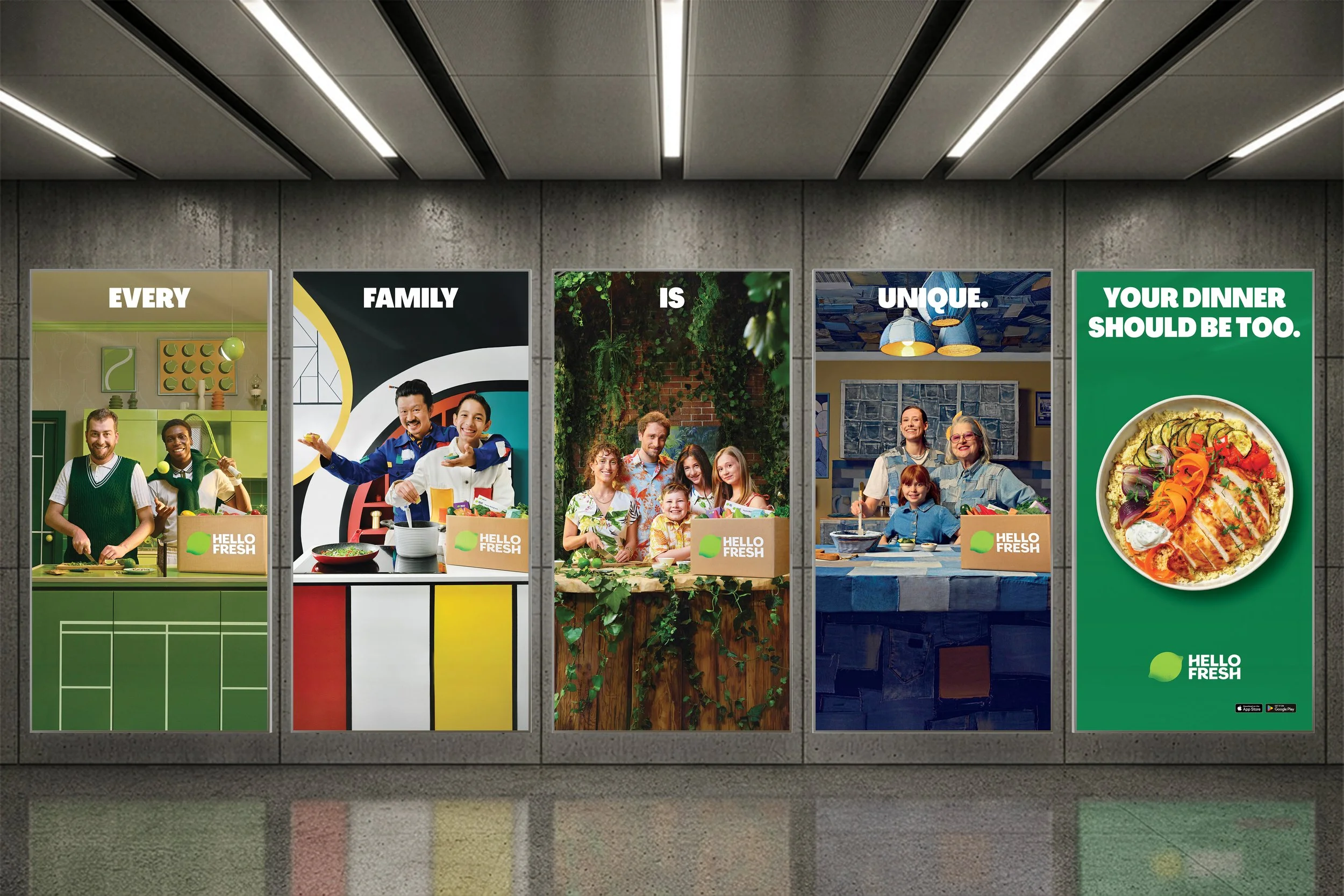
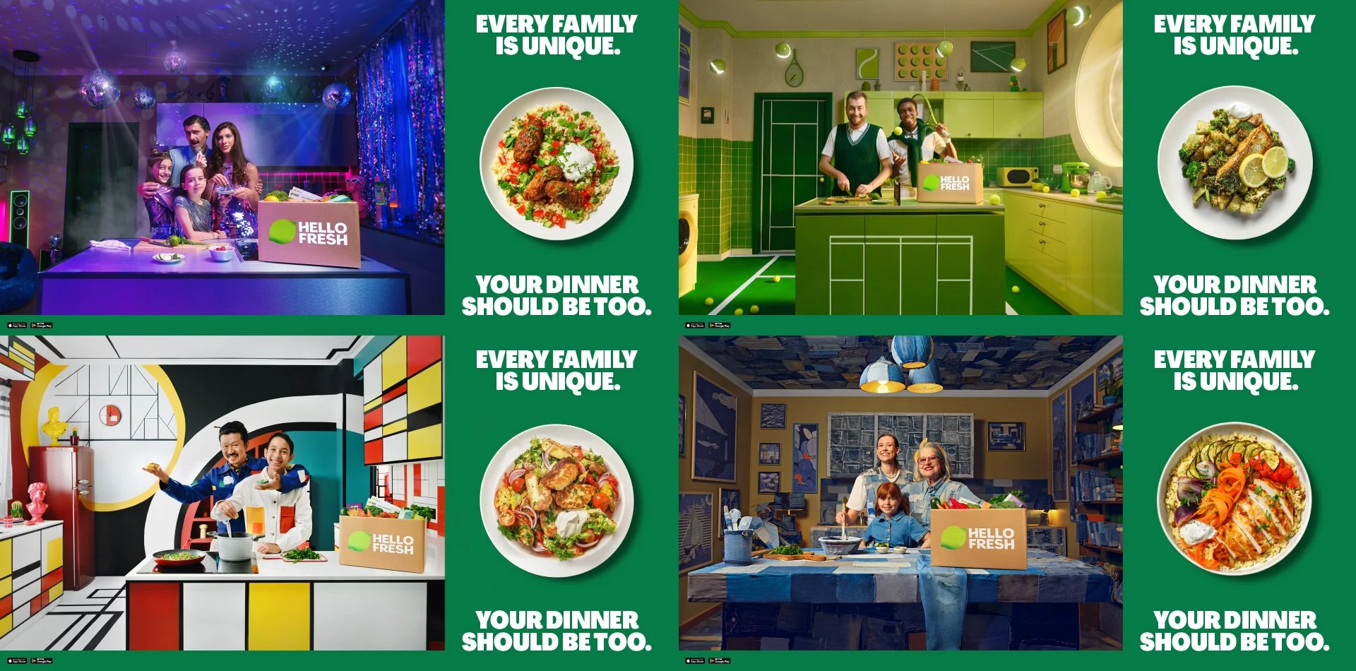
OOH print assets for the HelloFresh Back to School Campaign, highlighting how HelloFresh simplifies weeknight dinners while offering unique meal experiences, featuring diverse families and adapting to different needs and lifestyles.
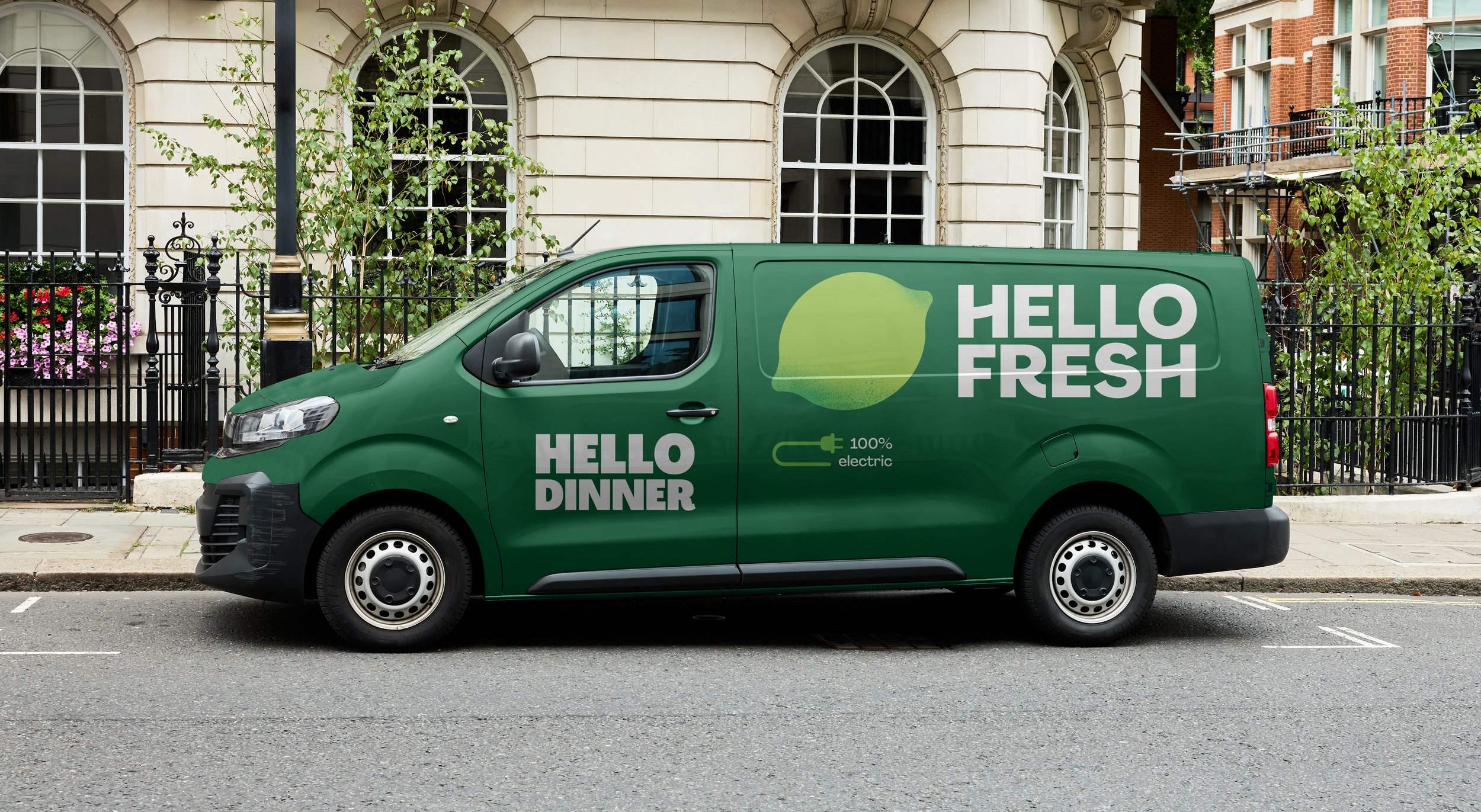
As HelloFresh expands across Europe, its delivery vans become moving touchpoints for the brand. The design combines logo, typography, colours, and iconography to express sustainability. This approach creates a flexible visual system that adapts seamlessly across markets while maintaining a consistent identity, regardless of language or messaging.
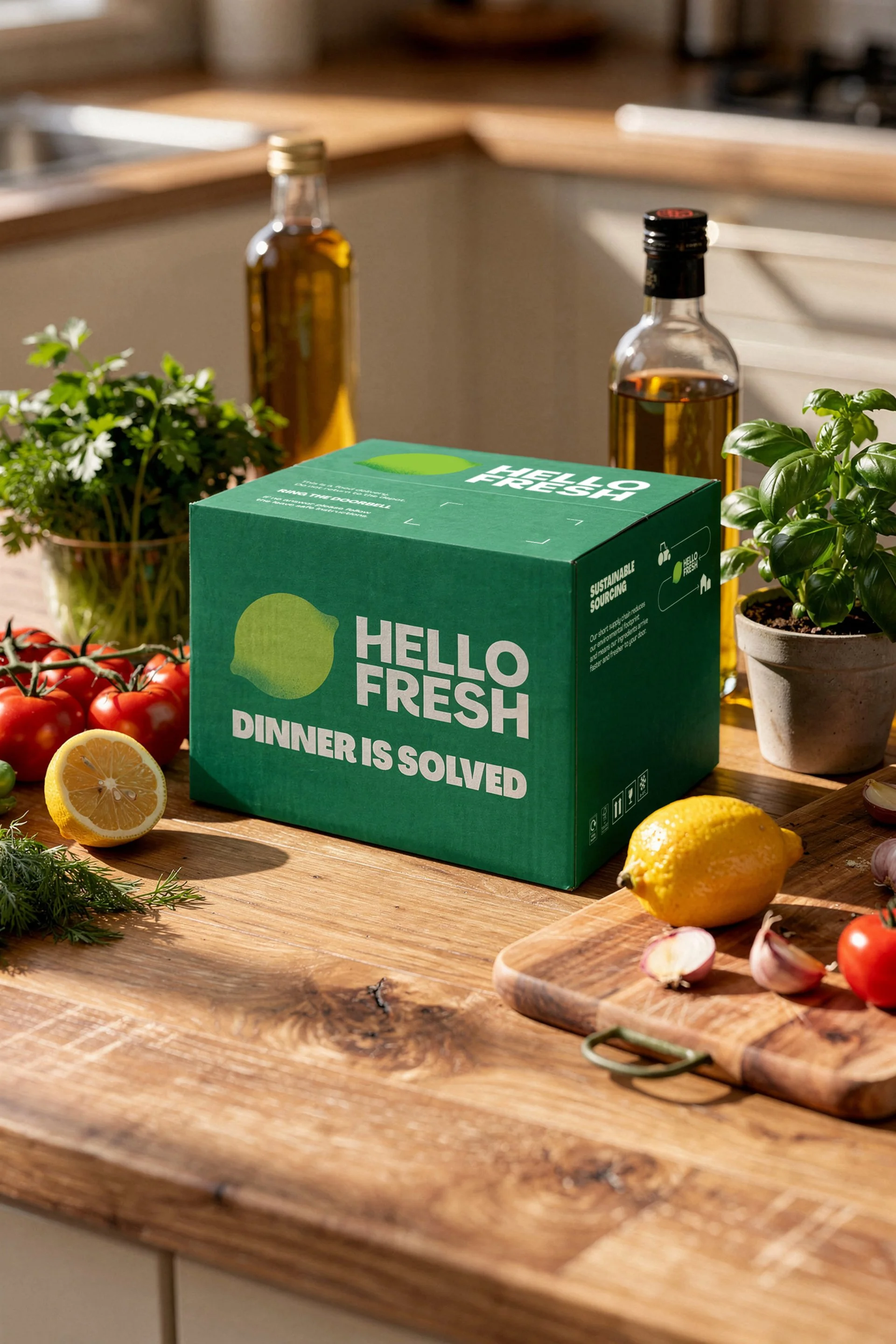
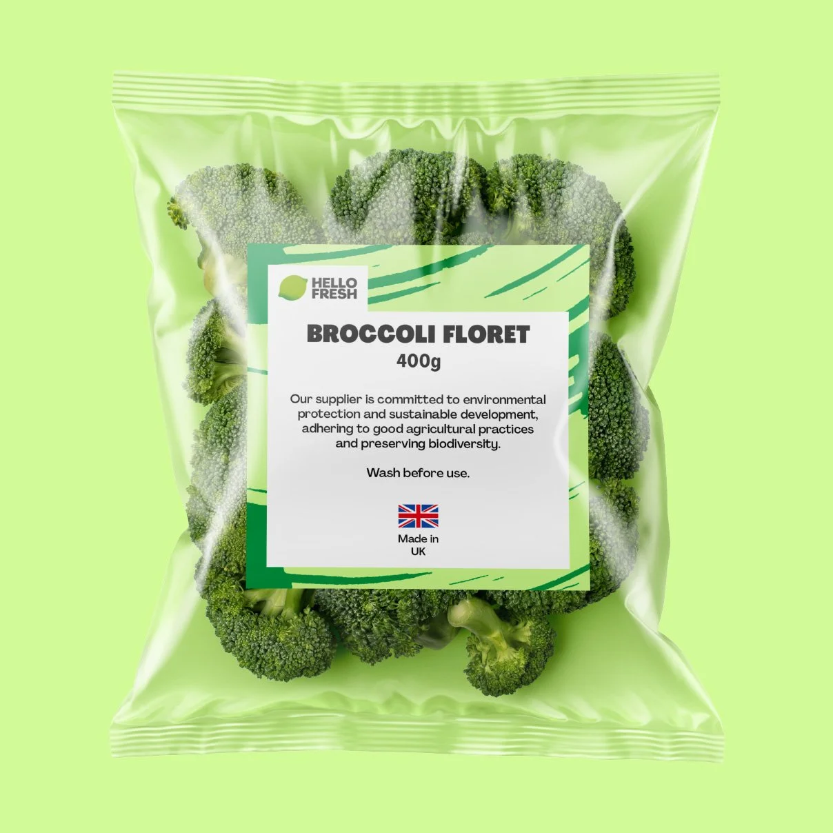
Packaging development was led across international markets, extending from box design to a broader packaging and label ecosystem. Art direction was driven from concept to production, in close collaboration with stakeholders across departments, aligning design decisions with regulatory, supply chain and local market requirements. A modular framework built around layout, typography, colour and pattern ensured consistency throughout. Packaging guidelines authored along the way let the team apply it independently as the scope grew.
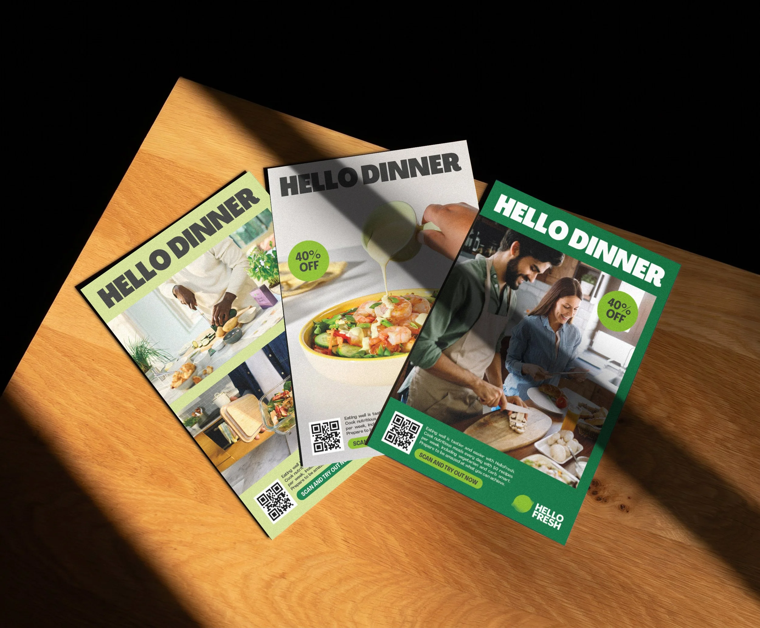
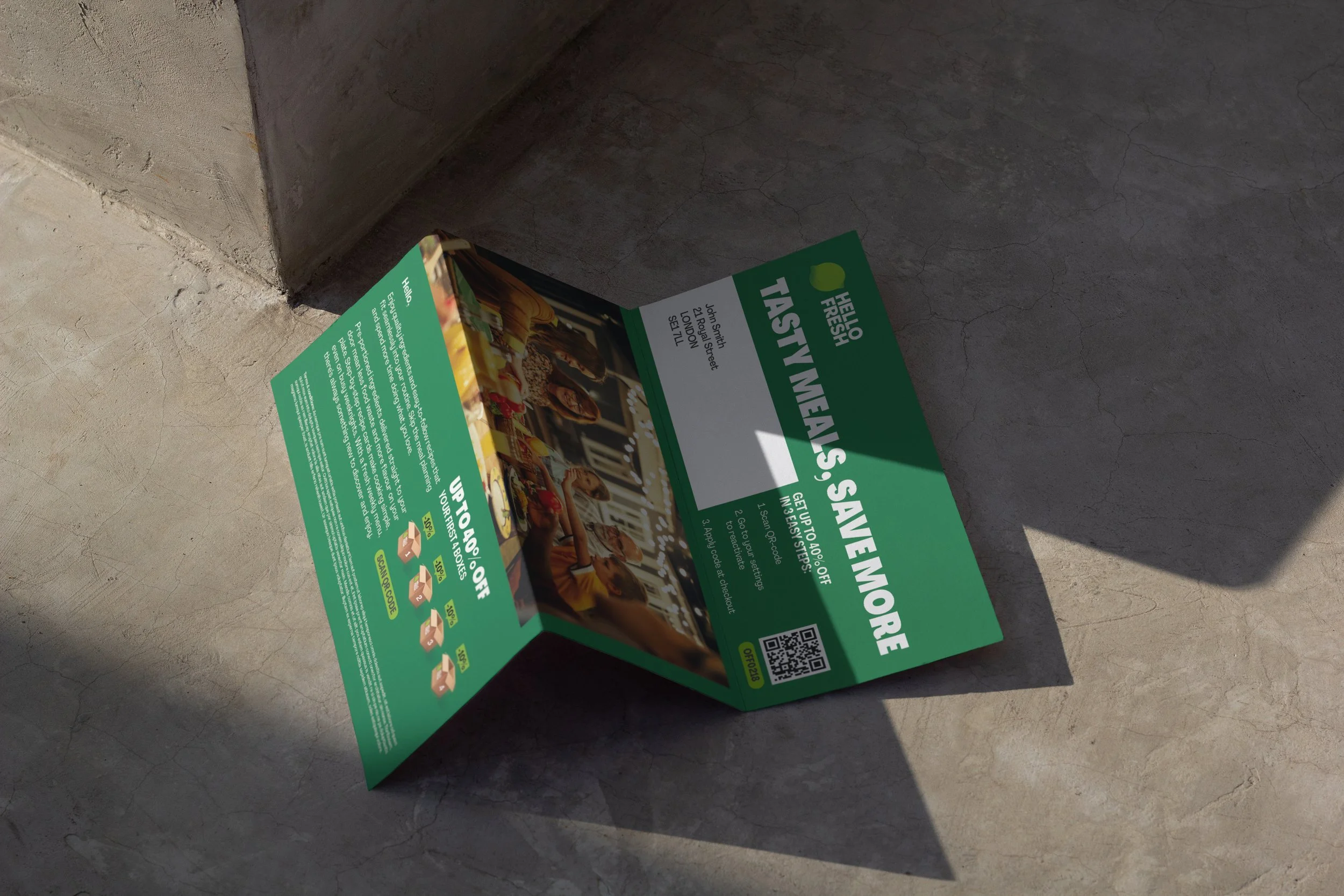
The HelloFresh print materials are designed to create a consistent brand experience across markets. Templates and guidelines were developed for flyers, direct mail, gift cards, and booklets, forming a scalable system that can flexibly adapt to different campaigns and business needs, using both primary or seasonal colour palettes. Together, they help designers create localised content efficiently while staying aligned with the brand identity.